Versions Compared
compared with
Key
- This line was added.
- This line was removed.
- Formatting was changed.
| Info |
|---|
The widgets on the Analysis tab can show consolidated data for the entire organization (default), or a breakdown by:
|
Units
 Image Removed
 Image Added
Description | Displays a line chart for the date range showing the selected metric, which can be one of:
|
|---|
Rates
 Image Removed
 Image Added
Description | Displays a line chart for the date range showing the selected metric, which can be one of:
|
|---|
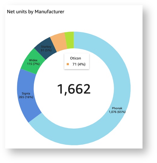
Unit breakdown
 Image Removed
 Image Added
Description | Displays a donut chart showing the selected metric, which can be one of:
|
|---|
| Panel | ||||||
|---|---|---|---|---|---|---|
| ||||||
|
| Panel | ||||||||||||
|---|---|---|---|---|---|---|---|---|---|---|---|---|
| ||||||||||||
|
| Panel | ||||||
|---|---|---|---|---|---|---|
| ||||||