Versions Compared
Key
- This line was added.
- This line was removed.
- Formatting was changed.
| Info |
|---|
This page refers to the standard KPI dashboard, but the techniques described can be used with any interactive dashboards, including those which have been custom-built. |
Interactive filtering
By default, the KPI dashboard shows all data for the current year. However, it is very easy to change the date range or filter the data using the interactive filters at the top of the dashboard. Image Removed
 Image Added
For example, clicking the Start date selector will open a date picker control.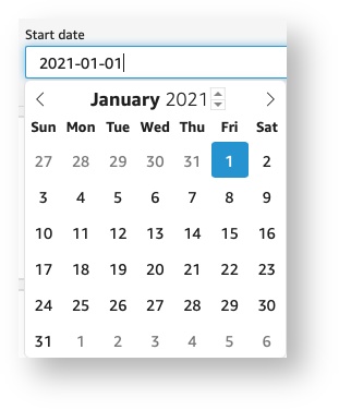 Image Removed
 Image Added
The other filters allow filtering by:
Location
Provider
Manufacturer
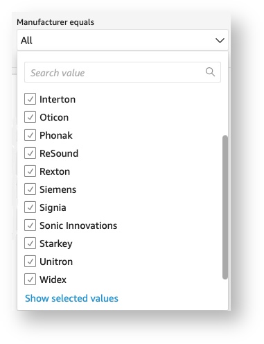 Image Removed
 Image Added
Here are a few examples of interesting questions which can be answered using just data filtering:
How much did location A contribute to total revenue?
How much did provider A contribute to gross profit?
What is the return rate for provider A? for Manufacturer B?
What was our no-show rate last December?
Interactive widgets
The Net revenue by month widget (on the KPI tab), and all of the widgets on the Analysis tab allow grouping by location, provider, or manufacturer. Image Removed
 Image Added
 In addition, the widgets on the Analysis tab allows selecting different metrics of interest.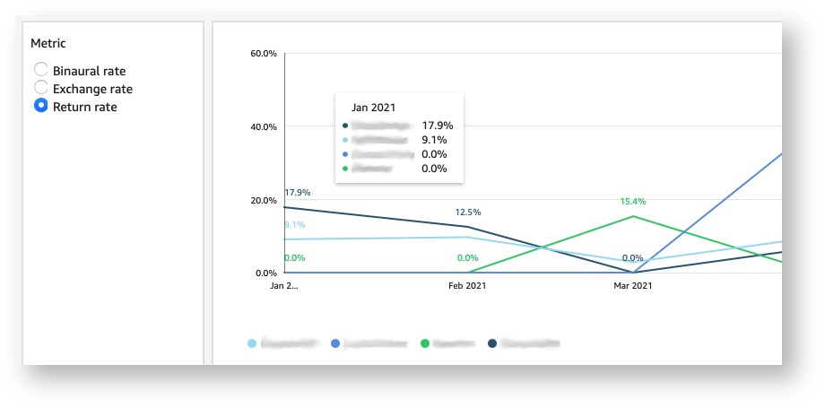 Image Removed
 Image Added
This provides easy insight into the following questions:
How much did each location contribute to total revenue?
How much did each provider contribute to total revenue?
How does our return rate vary by provider? By manufacturer?
How has the ASP for provider X changed over the last 6 months?
How does our no-show rate vary by location?
Focusing on a specific group
When using the Analysis tab, clicking a legend entry (or a data point) on a widget allows you to focus all widgets on the page on a specific group (e.g. a manufacturer, location, or provider).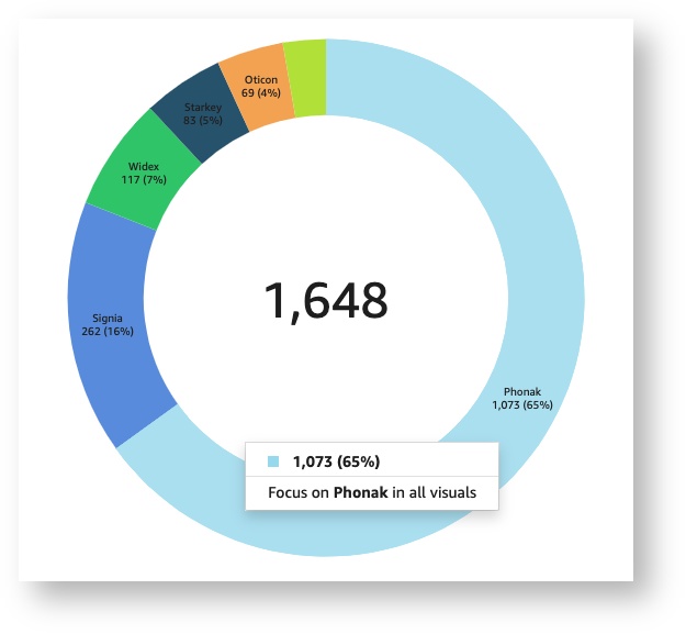 Image Removed
 Image Added
Clicking the option shown in the example above would filter all widgets on the page to show only data for Phonak. (In the selected visual, the other groups would remain visible, but dimmed).
To remove the focus and show all data, click on the legend entry or data point once again.
Changing the timescale resolution
For widgets showing the timescale on the X-axis, the resolution can be increased or decreased using the Drill down and Drill up options that appear when a data point is clicked. Image Removed
 Image Added
The Undo button at the top of the dashboard will restore the default timescale. Image Removed
 Image Added
Creating automatic alerts
Dashboards can send automated alerts by email when a metric reaches a particular threshold. To set up an automatic alert for a metric, select the widget and then click the Add alert (bell) button.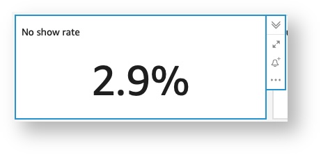 Image Removed
 Image Added
 Image Added
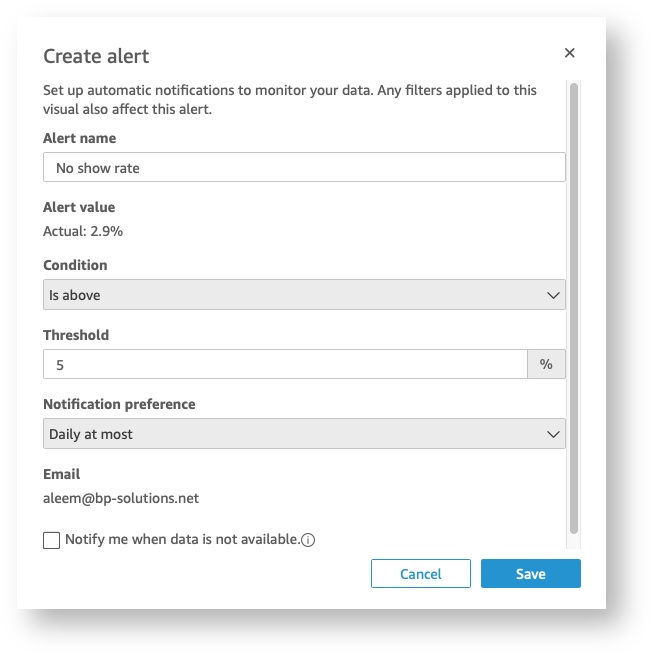 Image Removed
Printing or downloading a PDF version of the dashboard
Click the Export button at the top-right corner of the screen to print the dashboard or export a PDF version.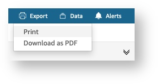 Image Removed
 Image Added
| Panel | ||||||
|---|---|---|---|---|---|---|
| ||||||
|
| Panel | ||||||||||||
|---|---|---|---|---|---|---|---|---|---|---|---|---|
| ||||||||||||
|
| Panel | ||||||
|---|---|---|---|---|---|---|
| ||||||